
by Leanne Mordue on 25-Feb-2016 14:06:00

If your B2B business doesn't have a mobile website by now, you could be missing out. After the so-called ‘Google Mobilegeddon’ in April 2015, the importance of mobile websites became evident. A report by Adobe Systems revealed that following Google's changes to favour mobile-friendly sites, traffic from Google mobile searches to website that weren't mobile-friendly dropped 12% in the couple of months after the changes. Prior to Google Mobilegeddon, Google announced its plans to favour sites utilising separated links (which are easier to use on touchscreen devices) and larger text – those sites which looked better on smaller screens.
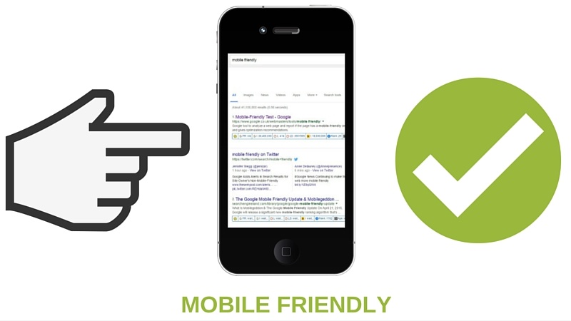
What changes did Google Mobilegeddon bring?
Google's most recent algorithm update, aptly named 'Google Mobilegeddon', was rolled out on 21st April 2015. Their mobile-friendly ranking algorithm was designed to boost mobile-friendly pages in search results. This was Google's biggest change in two years and has had a huge impact on search engine rankings, with mobile-friendly sites ranking higher than non-responsive sites. Panda and Penguin, Google's two previous algorithm updates, affected 12% and 3% of search results, but the impact from Mobilegeddon could be much more widely felt. We reported on this update last year - Mobile Apocalypse - Google's Mobile Algorithm Set for April Release Date: Are You Ready?
How important are mobile websites?
Mobile websites have become more important than ever before, and that's due in part to the fact that the way we browse the web is changing. More of us are browsing on smartphones than we did previously. In fact, a study carried out by eMarketer estimated that by 2016, around 40% of the world's population could be browsing the web on smartphones – that's because access to the technology required is becoming increasingly affordable. According to eMarketer, in the UK we spend more time on mobile devices than we do on our desktop PCs – an average of 2 hours 26 minutes a day browsing on our mobile devices and just 2 hours 13 minutes a day on desktop PCs. Google estimates that around half of all searches are conducted using mobile devices.
Losing money
Research carried out by comScore revealed that 184 million people now own a smartphone – and Google search is the 4th most downloaded app worldwide. So if your website isn't mobile friendly by now, you're risking losing traffic, which could affect your company's chances of survival in a competitive marketplace. With 84% of consumers using search engines for information gathering before making a local purchase, a website which isn't mobile-friendly could lose you sales – both online and in your retail store.
What's the solution?
It might sound obvious, but mobile responsive design is the best way to future-proof your website to ensure it's mobile-friendly. Responsive design automatically adjusts the text, buttons and other aspects of your website to fit to the screen size of the device you're using. It focuses on four main sizes – widescreen monitors (used with desktop PCs), smaller screens on laptops and desktop PCs, tablets and smartphones. Learn more about key features to include with this article - Building A B2B Mobile Website? 8 Must-Know Ingredients To Include.
This means that no matter what device your visitors are using, your site will be perfectly optimised for viewing. Buttons, fonts, links – all will be adjusted in size for a positive browsing experience. Yes, it can cost more to overhaul your site with mobile responsive design. However, in the long run it can save you time and money – not only because you don't have to create a separate mobile URL and update that as well as your main desktop site, but also because you won't risk losing traffic (and sales) to other sites that are mobile-friendly.
Mobile websites are the future
Like it or not, mobile websites are here to stay and as technology becomes more advanced – and more accessible – than ever before, more of use will be browsing the web from our smartphones. This means your website needs to be accessible by anyone, using any device, in order to reach the widest audience and boost your conversion rates.
If your website isn't mobile-friendly, Google won't rank you highly, which means dropping down the search results, and dropping rates of traffic to your website. Investing some cash now in responsive design means that if (or when) Google release a new algorithm that further increases the importance of mobile-friendly sites in their search rankings, you'll be prepared with your mobile-friendly site. Future-proofing your website is the best way to ensure that you don't get left behind when more changes take place – and they will.


Mobile Websites vs Mobile Apps - Which Is Best For Your Business?
Who will win the battle? If you are planning to take advantage of the huge growth in mobile marketing you're probably wondering what would be the best …
How To Make Your B2B Website Mobile Friendly
If you're wondering how to make your website mobile friendly, you're not alone. With more people than ever before accessing the web from a mobile devi …

Building A B2B Mobile Website? 8 Must-Know Ingredients To Include
If you're looking to build a B2B mobile website – first, well done! Mobile websites are the future, with more people browsing on a mobile device than …