
by Leanne Mordue on 28-Dec-2015 11:29:00

We know that browsing the internet on a mobile device is becoming more common, but did you know that smartphones are now the most popular way to browse the internet? A report written by Ofcom revealed that the average adult now spends nearly two hours a day browsing the web on their phone. So can you really afford for your website to fail Google's mobile-friendly test? Ensuring your website is mobile-friendly means that you are harnessing the purchasing-power of the whole marketplace – you're not alienating any users who choose to browse your site from a mobile device. If users can't view the content they need on your site, you could very well risk losing them to competitors who do have mobile-friendly sites.
Test your site
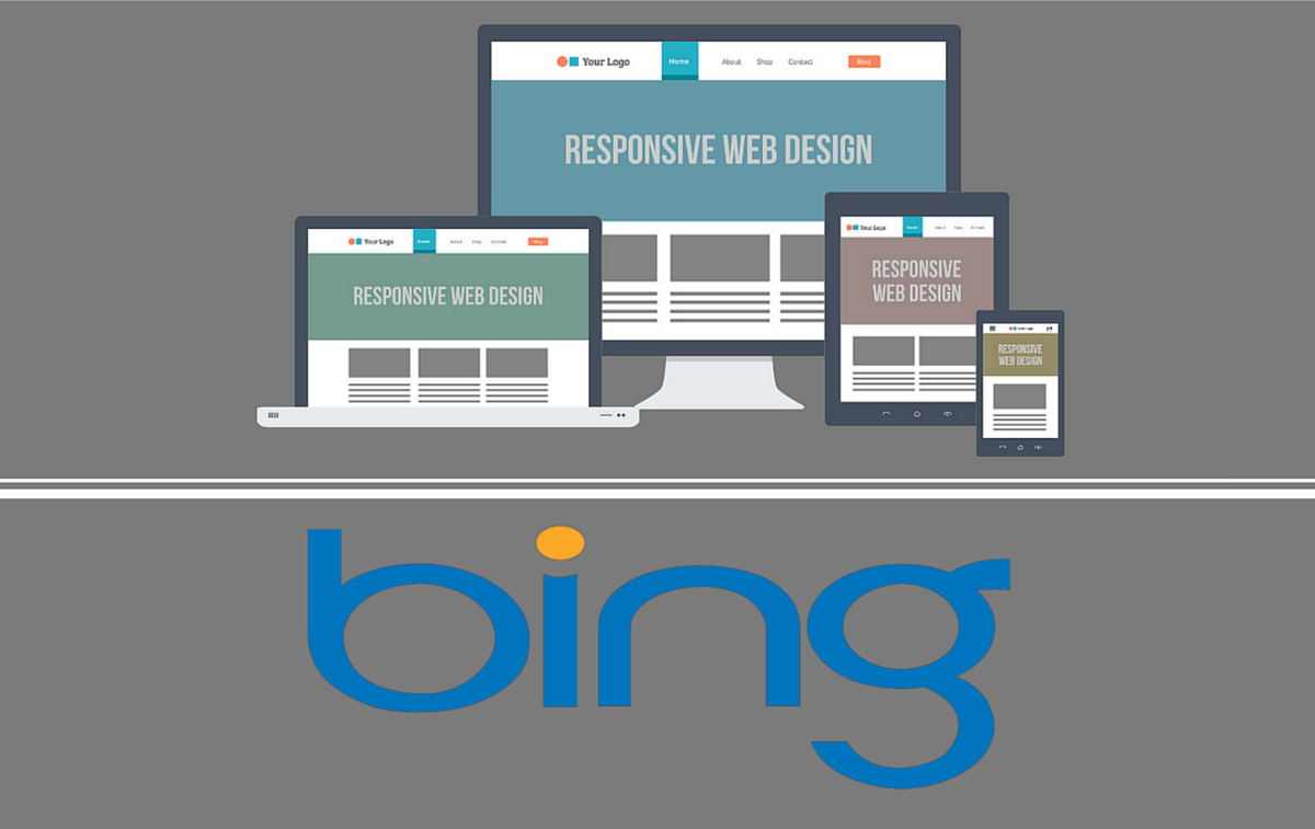
The Google mobile-friendly test has made it easier than ever before for businesses to tell if their site is mobile-friendly – so there are no excuses. Simply plug in your web page URL on the Google mobile-friendly check page and Google will analyse it to discover if it is mobile-friendly. Not only is it important to Google if your site is mobile friendly but Bing also take great interest, here is a great article - Bing Follows in Google's Mobile Friendly Ranking Algorithm Trail. It's all good if you pass the check – congratulations! But what happens if the test says your site isn't mobile-friendly; what can you do?
Your 6-step action plan
Luckily, the test doesn't just leave you fumbling around in the dark if your site doesn't cut the mustard; it gives you some rather helpful pointers that can highlight any issues with your site – these could include:
- Links are too close together
- Slow loading mobile pages
- Text is too small to read
- Mobile viewport not set
- Irrelevant cross-links
And a host of other issues including problems with plug-ins (such as Flash Player). So how do you make your site mobile-friendly? Here is your 6-step action plan.
 1. Avoid Unplayable Content
If you have ever visited a site on your mobile device and found yourself faced with an unplayable video or other content, you will know what a frustrating experience that can be for users, particularly when you need access to content on-the-go and don't have the option of returning home to view the full site on a laptop or desktop PC. Mistakes such as featuring unplayable videos are actually fairly common. Websites which use Flash Player, for example (which isn't supported by iOS devices) could leave users irritated and the results could cost you dear, even affecting your Google rankings. Check, double check and triple check that any video content you include can be played across all mobile devices – it doesn't necessarily mean a complete site re-design.
When users visit a page with video or other content that isn't supported on their mobile device, they will see an error message telling them they can watch the content later on a PC. This type of rookie error can be avoided by using HTML 5 standard tags to include animations or video on your site – ensure you use video embedding that will play across all devices (such as Windows, Android and iOS smartphones and tablets).
 2. Watch out for unreadable content
There is nothing worse than a site with text that is too small to read on mobile devices, and users will simply go elsewhere if your site isn't viewable on a smaller screen. Text on your site should be readable on any device, from a 4” smartphone screen to a 24” PC monitor – it's important not only to use an appropriate font size (at least 14px is recommended), but ensure you choose a clear, easy-to-read font too. Don't forget about buttons either; making them bigger rather than smaller means there is less risk of users missing them or clicking on the wrong button, creating a frustrating user experience. Remember, you want users to have the best possible experience when visiting your site.
 3. Use a Mobile-First Responsive Design
Redesigning your site is definitely the best way forward to ensure that it is mobile-friendly. Responsive design means your users will have the best experience when browsing your site, whatever type of device they are using (mobile or otherwise). Responsive design ensures a consistent experience across all devices, because it allows you to enhance your site's functionality and design for viewing on larger screens. Your site will appear similar to the desktop version whether it is viewed on a 4” smartphone screen or on a 10” tablet.
 4. Make Sure your Images are High-Resolution
When you consider that the latest iOS and Android devices have high-definition screens, it's easy to see why it is so important to use high-resolution images on your responsive website. This is even more important if your services or products are primarily visual – for example if you're a graphic design firm or a commercial photography company. Blurry images can create a negative first impression of your business, making you appear unprofessional. Ensuring that all images you use are high-res means that users will have the best possible experience of your website, which means a great first impression of your company and improved conversion rates!
 5. Keep your Options Open
Even the most beautiful mobile websites shouldn't constrain your user's experience. Some people will always prefer the 'full site' experience, so including a 'view desktop version' or 'view full site' button at the bottom of your site ensures you keep users happy. Failing to do this could mean you lose a potential customer just because they prefer the desktop version of your site – there may be functionality on the full site that they need, or maybe they just prefer the ease of navigating your desktop site.
 6. Test, Test and Test Again
Don't ever stop testing your responsive website – and we're not just talking about using the Google mobile-friendly check. Testing is even more important than usual when it comes to mobile-friendly sites. Think of all the different devices which could be used to view your site – iPhones, iPads, Android phones and tablets, Windows phones and tablets – you need to test your site on every one of these. It's not just a case of a quick scroll of the homepage; test all pages, buttons and user actions as well as keeping a eye on loading times and checking that images are high-resolution on all devices. Test your site yourself and put yourself in the user's shoes or ask somebody who wasn't involved in the design of the site to test it for you and give you honest feedback.
Ensuring your site is mobile-friendly doesn't have to be a headache, and with this 6-step action plan you will be well on the way to creating a positive experience for all users. If you are still unsure about a mobile site then give this article a read - 5 Reasons You Need To Have A Mobile Friendly Website.

Bing Follows in Google's Mobile Friendly Ranking Algorithm Trail
In April this year Google released its biggest ever Mobile Algorithm which shook not only the SEO world, but also the entire online universe! Business …

Google Set To Ramp Up Their Mobile Algorithm This May - The Time To Get Mobile Is Now!
One of the latest, major updates to the Google Algorithm came last April and was dubbed by many as “Mobilegeddon”. It focused on making sure websites …

Mobile Apocalypse - Google's Mobile Algorithm Set for April Release Date: Are You Ready?
Imagine getting a lot of traffic from a keyword in the mobile search results on Google and then this traffic is suddenly obliterated, vanishing into t …