
by Will Williamson on 11-Jun-2020 11:44:00
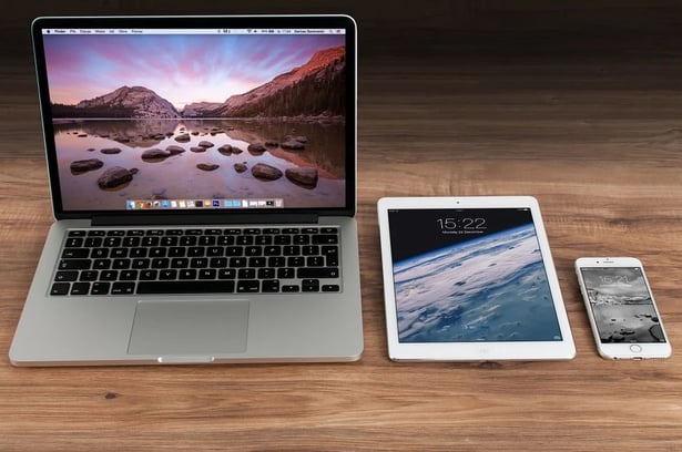
Today’s Internet users want to access websites in a variety of ways. Some consumers want to research products and services from their office computers and laptops, while others want to do so on the move, using phones and tablets.
With more and more people making the Internet their first port of call when choosing suppliers, it’s crucial to have a user-friendly site.
How can you provide all your website visitors with an experience they’ll love?

Desktop And Laptop vs. Mobile Visits – How Do User Requirements Differ?
While everyone’s situation and habits are different, many people who are using desktops or laptops will likely be doing so from work during regular office hours. In contrast, people using smartphones and tablets may be working remotely, or at home, and be using their devices at any time of day or night. These groups’ needs differ in three key ways.
1) Convenience
While those using desktops and laptops may have time to peruse multiple pages on your website, mobile users are more likely to be in a hurry. This means they’ll want to find information quickly.
Don’t make the mistake of providing them with less content, however – they still want to be well informed. Instead, they’ll be looking for clutter-free pages, clear navigation options, large buttons to make tapping simpler, legible fonts, a dark mode option, and drop-down lists in place of text boxes on forms.
2) Features
Mobile users may be using your website when they’re on the move, so provide them with features that make life simpler for them. For example, providing a click-to-call button will enable smartphone users to contact you without leaving your website, while adding a map will allow those on phones and tablets to locate your premises with ease.
Desktop users, on the other hand, may prefer a range of contact options available to them, so ensure that you utilise contact forms, email address links, chatbots, and Skype call options on their version of the site where appropriate.
3) Up-To-The-Minute Content
One of the biggest benefits of being able to access the Internet from a mobile phone or tablet is that you can find information 24 hours a day. Providing links to your social media accounts and automating your posts will allow mobile users to see your latest updates even when your company is closed.
You could also utilise dynamic pages so your website delivers different content at particular times of the year, on special occasions, or even after office hours.
How to select the right web design company
Pick a web design company that can build attractive and user-friendly desktop and mobile versions of your site. Choosing a local firm will make the process more straightforward.
If you’re searching for web designers in Derby, look no further than JDR. As business growth specialists, we can provide you with exceptional web design services and create a marketing plan for your business using your new site as the focal point.

Image source: Pixabay

Basic Principles Of Web Design For Marketers
Even for businesses that understand the need for a good website, it isn’t always clear how marketing principles can be built into the design itself to …
The Future of Web Design: Harnessing HubSpot CMS for Engaging Websites
HubSpot CMS is a dynamic web design and hosting platform for businesses of all sizes, with particularly strong benefits for small and medium-sized com …
Why You're Shooting Yourself In The Foot If You Choose Cheap Web Design
In today's society people are very good at avoiding marketing altogether. We tend to dodge sales calls and delete irrelevant emails because we hate be …